Q: Ray,
My lodge's flap was recently denied because of the new brand guidelines. What advice do you have for our leadership? It seems quite difficult to adhere to these standards.
A:
When thinking about the our new branding guide, it’s important to remember they’re meant to be tools, not rules. Yes, there are standards we follow when using the various logo elements of the OA, however the guide overall is meant to give you a set of tools with which you can create patches and graphics of all kinds. This will strengthen the identity of both the OA and your lodge.
When approaching a patch design specifically, there are a few key factors to keep in mind. The best way to include the OA identity in your patch is the inclusion of the OA trademark arrow. It’s our simplest, most compact logo element that communicates “OA” as efficiently as possible. Remember, if you’re using it at a size smaller than 1in. x 1in., use the special embroidery trademark that omits detail from the arrowhead trademark to improve scalability. Finally, remember to leave the trademark free of any overlapping shapes or images. Though many lodges pair the arrow image with a totem, the OA identity is strongest and most consistent when it appears on its own with plenty of space to breath.
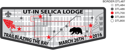
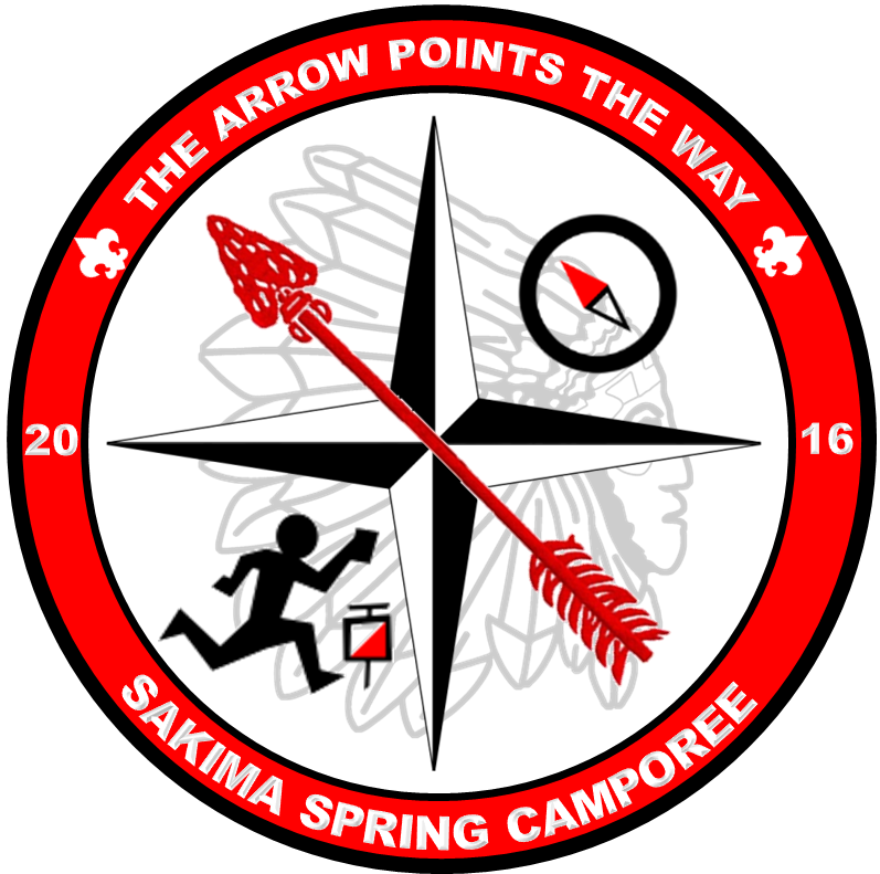
Below there are some examples of successful patch designs that use the OA brand elements:


If you need any further advice, or have any other questions, please reach out to @email.
Ray