Creating A Brand
Branding is the idea that by maintaining consistency with our product, graphics, and publications, members of the lodge and the community will recognize our organization by this imagery. Branding can appear in a variety of forms: a logo on graphics and merchandise, a lodge flap on a uniform, distinctive colors that are used in graphics and products, even the lodge name, number, or yell. The lodge or section’s brand is an integral piece to how the lodge or section creates publications, interacts with its council(s), and attracts new Ordeal members or Conclave attendees. Clear branding enables you and the lodge/section leadership to convey everything you want somebody to know about your lodge or section and the Order of the Arrow in one clear and concise message.
Remember that a lodge or section brand fits within the larger scale of the Order of the Arrow branding, as each lodge or section can be associated with the organization. And all branding must comply with Scouting America guidelines. Scouting America maintains a Brand Center to support field elements in using the correct imagery.
Brand deployment can occur in positive and negative ways. Imagine for instance that a younger Scout sees an Arrowman at a local council event with their lodge flap on and that member is promoting cheerful service or is at a booth talking about the spirit of brotherhood. This young Scout will now associate the lodge with one of these two aspects. Now, imagine that same Scout seeing an Arrowman horsing around at a council event or being actively disengaged from the event. This Scout will now not see the positive aspects of the organization because of the first impression, impacting the brand of the lodge. When developing your lodge or section’s brand, it can be helpful to ask the question: Does this brand help to further the message of the Order of the Arrow? How can our association help to enhance the lodge and the organization?
Your lodge or section’s brand should be distinct while still falling within the Order of the Arrow Branding Guidelines. The lodge or section brand will help to convey your intentions (e.g., service) and adds weight to the quality of an event because of the lodge or section’s association. Creation of a brand can be simply utilizing your lodge or section’s totem, but it is helpful to ensure that the brand is utilized correctly and not diluted. For instance, newsletter headers are a perfect time to have lodge or section branding present, but an agenda for a key leadership meeting wouldn’t necessitate such steps.
Remember, you are representing not just your lodge or section, but the OA as a whole in these publications. In the case of lodges, it is true that for many, the lodge will have the most contact they have with the Order of the Arrow and they will associate the whole OA to the lodge, so ensuring the lodge and the Order of the Arrow share the same message is vital.
To get started in creating your brand, we recommend working with the lodge or section communications committee and developing the following:
- A lodge or section seal and lodge or section logo.
- A set of colors that you would like used in your promotionals.
- A set of rules for using seals, logos, and colors.
- Standards for graphics and publications that are produced by your lodge or section.
When doing this, reference the OA Branding Guidelines to ensure your branding agrees with national standards. Beyond this, developing a good brand is as simple as using these elements regularly and consistently in your communications.
Basics Of Graphic Design
Graphic design is like the art you encounter every day, except it's not always hanging in a museum—it's all around us, in advertisements, websites, and more. Understanding the basics of graphic design can not only help you appreciate the artistry behind it but also enhance your marketing efforts. Here's a quick guide to get you started:
- Shapes: Shapes are the building blocks of design. They form layouts, create patterns, and structure elements on a page.
- Lines: Lines act as guides, dividing space, directing the eye, and forming shapes within a design.
- Color: Color is used to make elements stand out and evoke emotion. It's a powerful tool in conveying messages and branding.
- Typography: Typography sets the mood and aids communication. Choosing the right typeface is crucial for readability and conveying the intended message effectively.
- Images: Photos and illustrations tell stories and capture attention. They play a significant role in communicating messages visually.
- White Space: Also known as negative space, white space is essential for effective communication. It allows the eye to rest and focus on the message without distraction. Leaving white space in your graphic allows you to ensure the key information is included without overdoing with the design.
- Minimalism: Clean and simple designs are impactful because they are easy to remember and stand out. Less clutter means a clearer message.
- Readability: Select typefaces that are easy to read to ensure your message is understood quickly and clearly.
- Consistency: Consistency is key across all marketing materials. Use the same design elements, typefaces, and color schemes to reinforce your brand identity.
- Tools: Utilize graphic design tools like Canva, Adobe Creative Cloud, and PhotoPea to create professional-looking graphics and maintain brand consistency.
Graphic Design In Action
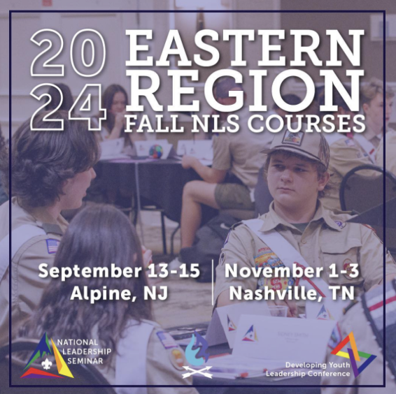
Consider the following graphic from the Eastern Region’s Instagram account:

Note the shape of the elements on the post. In general, the elements contained in the graphic are more square than any other shape. This goes a long way in showing the organized nature of the graphic. Around the edge of the post there is a set of lines that box in the clear information of the promotionals. The color of the graphic is a light purple, clearly evoking the branding and imagery that the Eastern Region utilizes in the majority of their posts, certainly helping with consistency in the region’s branding. The typography has a very clean look, emphasizing readability, and follows the typical OA branding guidelines. In the background of the graphic there is an image from a previous session of the National Leadership Seminar that clearly evokes what happens at the National Leadership Seminar.
Towards the center of the post, there is a large amount of white space that makes the image readable to see. As well as that, the white space and usage of only the essential promotional materials conveys a very strong sense of minimalism. Lastly, it is very clear this promotion was put together with some professional photo editing and graphic design tools. In this one simple graphic, the Eastern Region successfully used all ten major characteristics of graphic design to convey a message simply and effectively.
These characteristics are just the basics: as with web design, the best graphics are the result of experience and exploration. To get better at graphic design, do the following:
- Look at the social media pages of other lodges and sections. Find the posts that are visually appealing to you. Try to emulate that style.
- Look at the templates often provided by graphics design tools. Start there, and modify those templates with the purpose of the graphic and your lodge’s branding.
- Practice constantly. Seek feedback from others on your communications team, including your adviser.
Graphic Design Tools
Creating a unified and consistent look is only one part of the process. The second and most important part is ensuring that the brand is utilized and enforced on a consistent basis. Using the tools below, you’ll be able to ensure the brand is being enforced in a consistent manner.
Canva: A free tool that can be utilized to create fresh graphics for use on social media and other electronic communications.
| Pros | Cons |
|
|
Adobe Creative Cloud: Adobe Creative Cloud is a set of applications and services that gives subscribers access to a collection of software used for graphic design, video editing, web development, photography, along with a set of mobile applications and also some optional cloud services.
| Pros | Cons |
|
|
To get you started, the branding page on the Order of the Arrow has several resources to utilize. These include a pdf of branding guidelines, copies of Order of the Arrow assets in PNG and EPG, presentation templates, typography, color palettes, and an email signature.
Feel free to reach out to @email with any questions regarding the use of the OA branding guidelines or resources.